
Sumit DevTech
...


We build fluid, pixel-perfect, mobile-first responsive websites that deliver flawless user experiences across smartphones, tablets, laptops, and 4K displays.
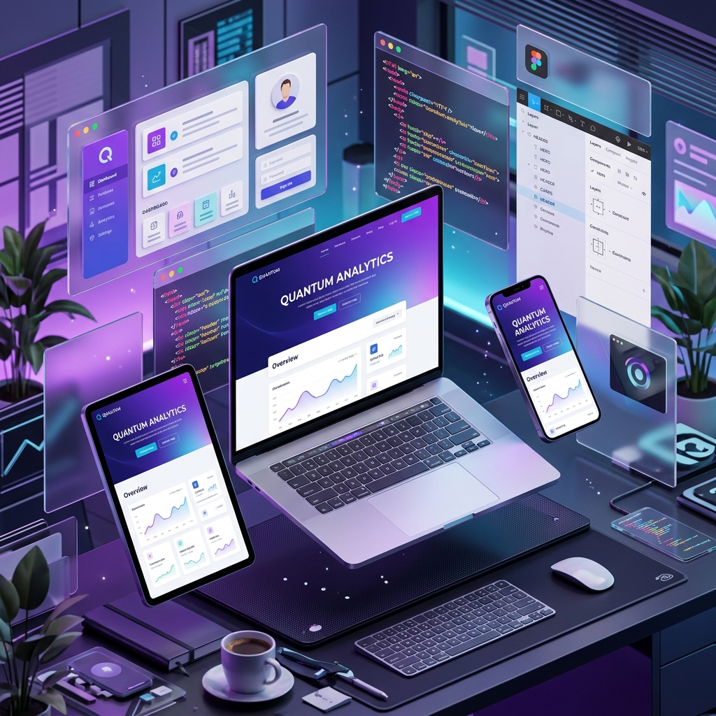
From mobile-first layout planning to fluid CSS breakpoints and touch gesture optimization, explore our responsive engineering hub.
Building smartphone UI viewports first for 70%+ of modern web traffic.
Adaptive Flexbox and CSS Grid scaling from 320px to 4K displays.
Thumb-friendly touch targets, mobile drawers, and swipe UI components.
Crisp SVG graphics and responsive srcset image optimization.
Frictionless mobile shopping carts and fluid checkout flows.
Rigorous testing across iOS, Android, tablets, and desktops.
Lightweight CSS & JS execution for sub-second mobile page loads.
Optimizing Core Web Vitals (CLS/LCP) for top mobile search rankings.
Discover our full suite of mobile-first responsive web design solutions tailored for modern multi-device audiences.
Designing intuitive smartphone interfaces first to capture 70%+ of modern mobile traffic with high engagement.
Adaptive CSS Grid and Flexbox layouts engineered to scale smoothly across 320px to 4K ultra-wide screens.
Thumb-friendly touch targets, gesture swipe carousels, collapsible menus, and smooth mobile micro-interactions.
Frictionless mobile shopping cart drawers, sticky purchase bars, and fluid mobile checkout optimization.
Transforming outdated fixed-width desktop sites into sleek, modern, high-converting responsive web portals.
Rigorously tested across real iOS, Android, Chrome, Safari, and Firefox viewports to guarantee 100% compatibility.
We follow a mobile-first responsive design methodology to deliver fluid, engaging, and high-converting websites.
Mobile screen size research, user flow mapping, and mobile-first wireframe prototypes.
Building adaptive Flexbox and CSS Grid layouts for 320px smartphones to 4K displays.
Testing touch gestures, mobile menus, and cross-browser viewport display scaling.
Minifying CSS/JS assets, optimizing Core Web Vitals, and launching your mobile-first website.
We craft custom mobile-first responsive web design experiences tailored specifically for diverse industry verticals.
Professional responsive corporate websites building authority across all devices.
Fluid online store layouts with mobile-first checkout and product galleries.
Patient-friendly, touch-optimized mobile interfaces for medical practices.
Modern responsive web portals with fluid dashboards and instant lead capture.
Find quick answers to common questions about our responsive website design services.
Over 70% of global web traffic comes from mobile devices. Responsive web design ensures your website automatically adjusts its layout to provide an optimal viewing and navigation experience on smartphones, tablets, and desktops.
Yes! We build fluid CSS Grid and Flexbox layouts tested across 320px smartphones, iPad/Android tablets, laptops, and 4K ultra-wide monitors to guarantee 100% display compatibility.
Google uses Mobile-First Indexing as a primary ranking signal. A fast, fully responsive website with strong Core Web Vitals (CLS & LCP) ranks significantly higher in Google search results.
Yes! We specialize in converting legacy fixed-width desktop websites into modern, mobile-first responsive websites without losing any existing content, SEO rankings, or brand assets.
Standard responsive website design projects typically take 1 to 3 weeks depending on project complexity, page count, and custom asset requirements.
Get in touch with our expert responsive web design team today for a free mobile audit and tailored quote.
Grab your FREE personalized ✨
Our experts are ready to help you kickstart your project



 ReactJS Website Development
 WordPress Website Development
 PHP Website Development
 Shopify Website Development